©2026 Darnell Wilbrink. All Rights Reserved.
What's this about?
For this project we worked with Stichting Digital Child Rights, an organisation that fights for a safe and inclusive internet for kids and young people. They came to us with a clear problem: teens with physical disabilities, like wheelchair users, often struggle to get out and socialise. Online life is easy, but it rarely turns into real-world connections.
Our job was to design something that could bridge that gap, something genuinely useful, safe, and built with those young people in mind.
Design Question
"How can we encourage vulnerable teenagers to go outside and meet peers, through a prototype that bridges their online and offline worlds?"
The problem
·Getting outside is hard when activities aren't built for you
·Meeting new people feels risky without knowing who they are
·Online feels safe, but doesn't lead to real friendships
·There's no trusted space that connects both worlds
What we were aiming for
·A safe digital space that nudges teens toward real-life activities
·Accessible for different types of disabilities
·Trust built through ID verification, no catfishing
·Go at your own pace, no pressure
How we worked
Iterative the whole way through. Research, design, test, repeat.
Research
Desk and field research to understand our audience. All insights went into a research report to kick things off.
Digging into insights
Stakeholder maps, journey maps, affinity diagrams, empathy maps. Understanding the problem before jumping to solutions.
Design sprint
Two weeks of ideas, then narrowing down. We picked the strongest bits and merged them into one concept.
Build, test, improve
Prototype in Figma, tested with real users, improved based on feedback including from the client.
Three rounds of testing
Every round something surprised us. Here's how the app evolved.
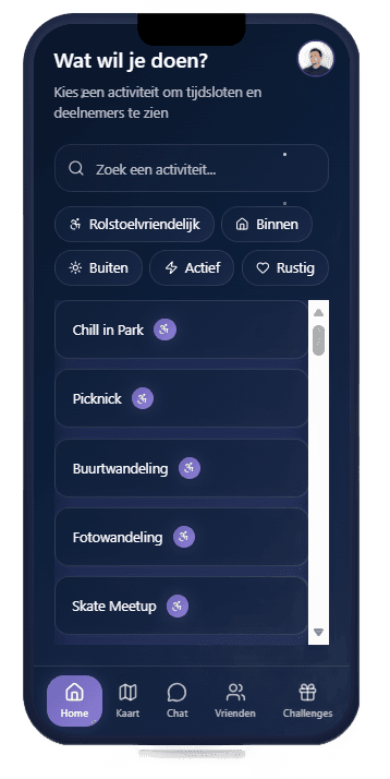
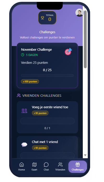

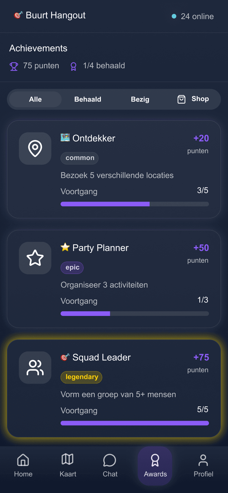
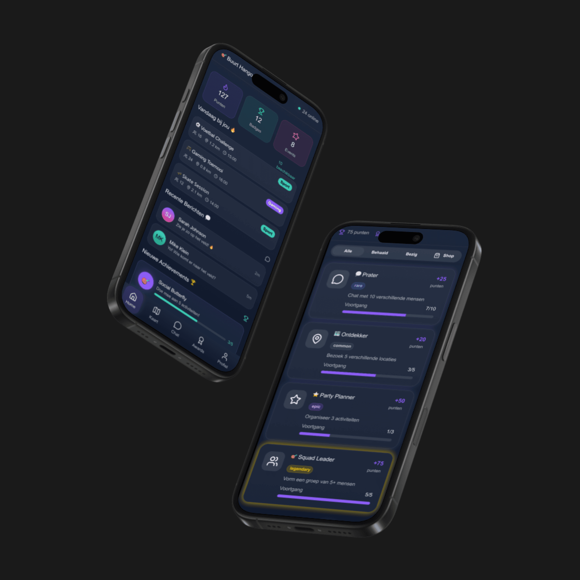
What we ended up building
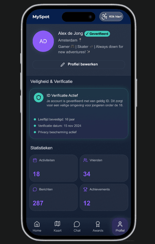
Four features that each make it a bit easier to take that step from screen to real life.
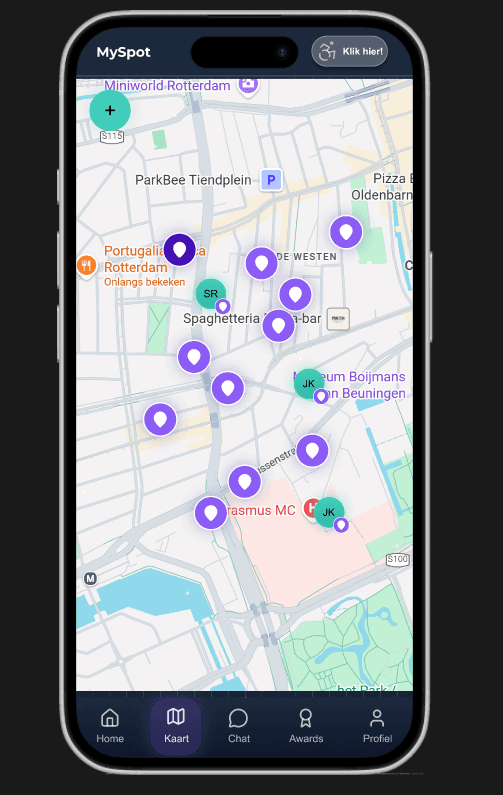
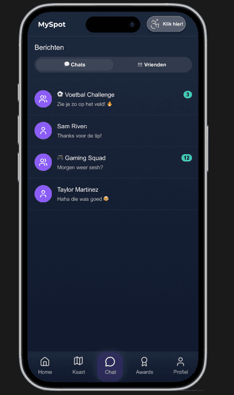
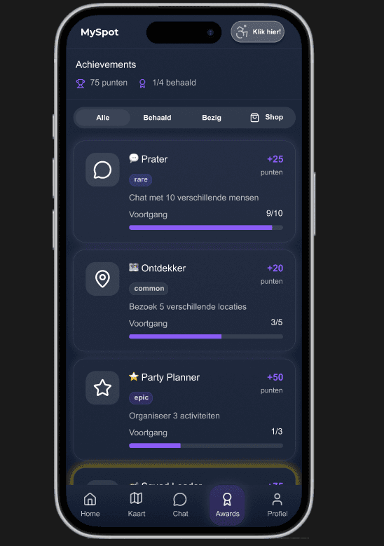
Honestly, what did I think?
This project reminded me that design is never just about how something looks. With a target audience like this, every small decision, a colour, a button label, a font size, has to actually work for them. That made the work feel more meaningful, but also more pressured.
The part I got the most out of was observing the user tests. Watching someone use the prototype you designed, seeing where they hesitate or get confused, is so much more useful than hearing about it second-hand. I'd lean into that even more next time.
Being the scribe felt a bit unglamorous at first, I'll be honest. But it turned out to be one of the most useful roles in the team. Keeping everyone on the same page across a long iterative project is really easy to underestimate.
If I could go back, I'd push myself to back up my visual choices with actual research data sooner. I made a few calls on gut feeling that worked out fine, but having the evidence would've made those conversations a lot easier and my decisions a lot stronger.
Observing real users
Watching people use your prototype beats any kind of team critique.
Scribing matters more than it sounds
Good notes kept our whole team aligned throughout a long project.
Design has to earn its place
Every visual choice needs to work for the user, not just look good.
Back your instincts with data
Trust your gut, but have the receipts to back it up when it counts.
Where could this go?
MySpot has a solid foundation. Here's what I'd want to see happen next.
More oversight from real organisations running activities
Expand beyond motor disabilities to include more groups
Real-time notifications so you don't miss what's happening
Better accessibility filters that reflect what users actually need
Help tooltips on the trickier screens, not everyone reads instructions
Clearer button labels that say what they actually do
Make safety features more visible. Users should feel it, not just trust it
More control over privacy, let users decide what they share and with who

MySpot
<— Back to Projects
